New look of the Statistics page
The Statistics page has undergone a complete redesign and now offers much greater flexibility in customizing its appearance and content, allowing you to tailor it exactly to your needs.
What's new
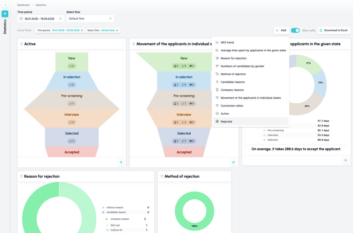
The page is now built on the same dashboard principle you already know from the main ATS Recruitis page. This means you can add and remove individual items, change their size and position on the page, and put together a view that shows exactly what matters most to you.
Filtering now works the same way you already know from other parts of the ATS Recruitis, for example the job listings page. The left panel shows the complete overview of available filters, and the ones you use most often can be pinned directly into the main part of the page so they're always within reach. When you don't need the filters, the panel can simply be minimized to free up more space for the data itself.
Another major addition is the ability to add the same chart multiple times, each with different filtering (via the gear icon on the chart). This lets you, for example, track the same chart side by side for two different departments and compare their results directly.
To keep the default dashboard view as clear as possible, not all available charts are shown when you first open the page – some of them, such as candidate counts by gender or rejection communication method, are hidden by default and need to be added to the dashboard manually.
How the charts have changed
The charts remain the same in terms of content, but their visual design has changed based on feedback we received on the previous version. The main updates include:
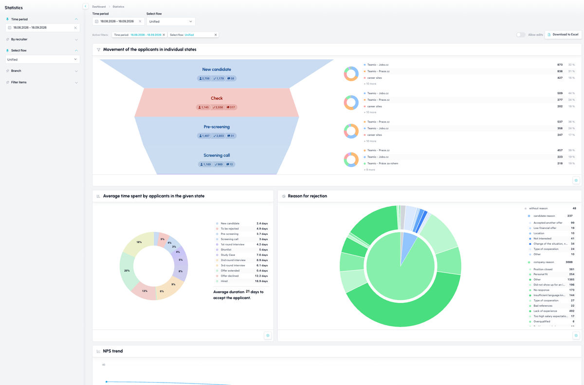
The funnel chart showing candidate movement across individual stages can now be displayed either as one combined chart or broken down into individual components (conversion, active, rejected) – depending on what you need to track at any given moment.
Individual parts of the funnel chart are now clickable. Clicking on a specific segment shows its detail, including a breakdown by source, so you can immediately see where the candidates in that stage came from.
We've added a brand-new NPS trend chart, making it easy to track how candidate satisfaction changes over time.
The rejection reasons chart now combines reasons on both the company's and the candidate's side into a single chart, with individual values clearly listed directly in the legend next to the chart. If this combined view isn't enough for you, you can also add separate charts for each category individually.
Which metrics you have available
- Overall funnel of candidate movement across statuses, active and rejected
- Funnel of candidate movement across statuses, so-called conversion rates
- Funnel showing the number of currently active candidates
- Funnel showing the number of currently rejected candidates
- Overview of rejection reasons, summarized by candidate, company and no reason given
- Overview of rejection reasons on the company's side
- Overview of rejection reasons on the candidate's side
- Current NPS trend
- Average time candidates spend in each stage of the selected recruitment flow
- Method of communicating the rejection
- Number of candidates by gender
What you can filter
- Time period
- Recruitment flow (this is key, since the main flow-movement metrics require selecting one specific flow)
- Branch - filters only positions whose place of work is at the given branch
- Filter items - filters only positions with the given filter item
Related articles
Webhooks for the Nelisa portal
Let ATS Recruitis automatically download your candidates from the Nelisa portal.
Impersonation
Combining the answers of a historically depersonalized candidate with a new answer.
Talent database and its possibilities
The talent database does not have to be used only for searching contacts for candidates.