First phase of the ATS Recruitis redesign
As part of the ATS Recruitis redesign project, we have reached the stage where the basic elements of the new look (especially the new menu and full screen content for all pages) can be turned on for a trial run.
The original version remains fully available and you can then switch back at any time.
How do I switch to the new look?
If you are interested in trying out the new look, just ask our support to enable this option, which we will do immediately.
Switching to the new version is then very easy and allows you to use all the features that ATS Recruitis offers.
On the main overview page, you will find the option to switch to the new version by scrolling all the way to the bottom of the page. From the new version, you can return to the original layout at any time in the same way.
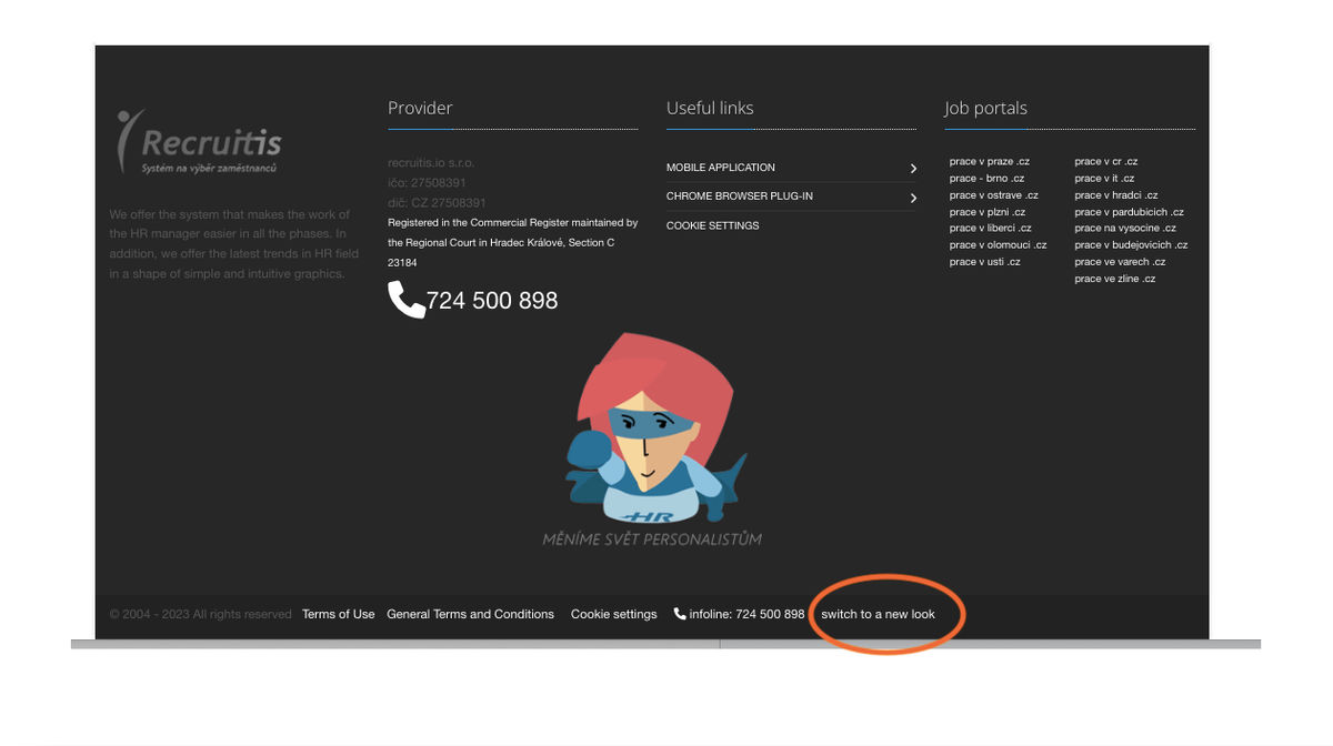
Fundamental changes
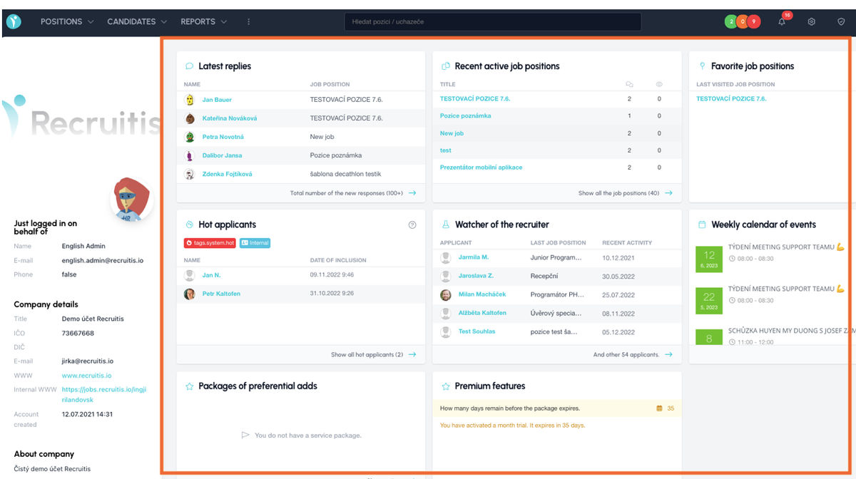
The major change is in the System Overview. At first glance, less data with information that is very systematically divided into its panels.
Navigation menu
The navigation menu is located at the top, where you will find three main categories, Position, Candidate and Reports (or Tasks if you are a manager). The Settings category is also an important part of the site, which is divided into sub-categories such as Company, Integration, Candidate, Position and Other.
The navigation menu also includes an SLA traffic light and the ability to search for a candidate or position via the search window.
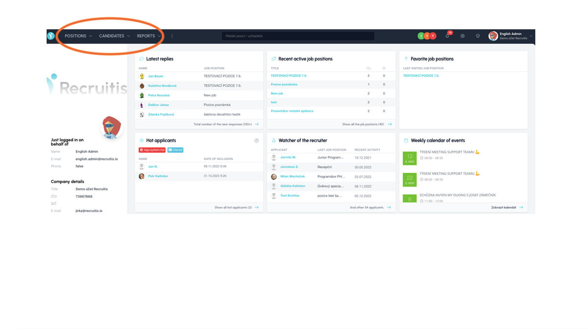
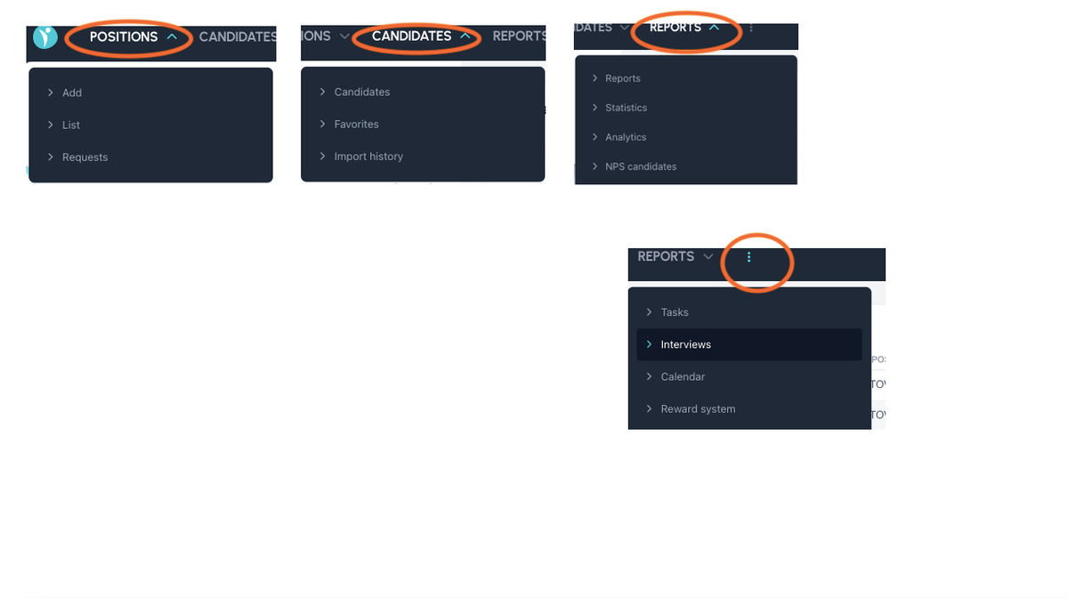
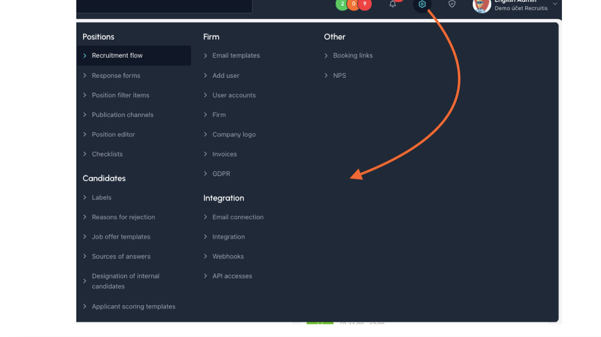
Overview of the main page
The overview of the main page is one of the pages that, in addition to the full-width view, has already undergone a redesign.
Full screen view of all pages
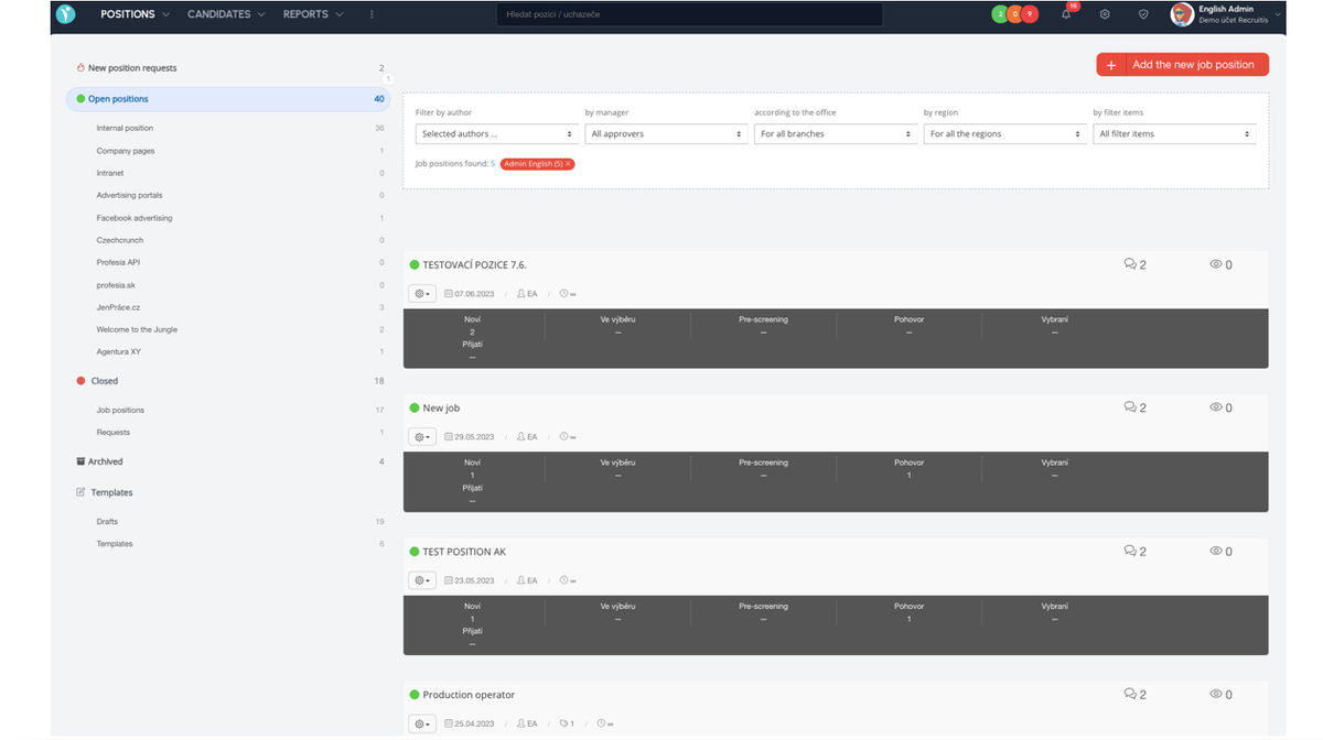
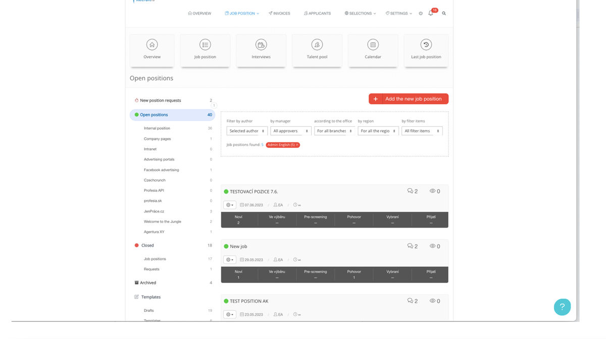
In the new design, all pages are displayed full screen instead of a fixed window in the middle of the screen, so some information (e.g. candidate card, list of positions, etc.) is displayed better and more clearly due to the larger space.
Related articles
Definition of flow recruitment
The recruitment process is a key element of the ATS Recruitis setup. You can set more than one according to different types of your positions.