New Position Detail [beta]
In Recruitis ATS we've prepared a new look for the position detail with candidate listing, which you can now activate using a toggle. This is part of a global redesign of the entire application, based on the look you already know from the new candidate profile and the new talent database.
This version is currently in beta – meaning it doesn't yet include all functionality, but is fully usable for everyday work. We'd be happy if you try out the new look and share your feedback with us. We're continuously incorporating your input, and once everything is addressed, we'll switch to the new design permanently. We'll of course notify you in advance via newsletter and in-app notifications before this happens.
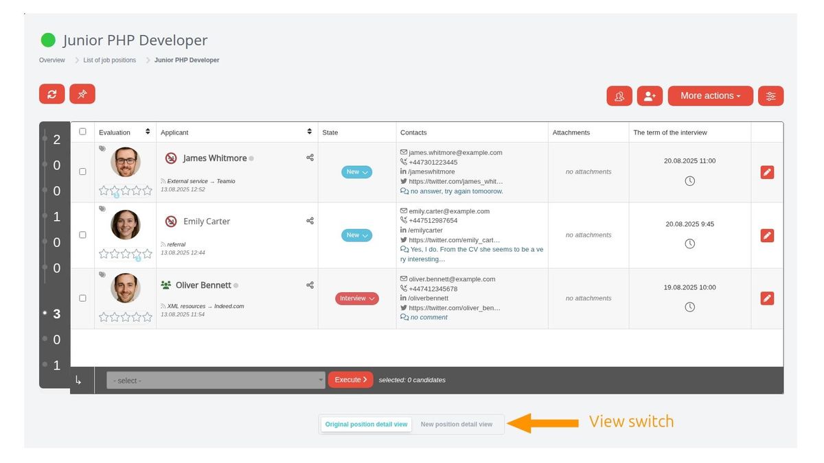
How to switch to the new look?
Below the candidate listing you'll find a toggle that lets you switch between the original (i.e. current) and new view:
What else is new besides the look?
The look, controls, and general functioning principles of the candidate listing on a position have been unified with the new talent pool design, so from the user's perspective, working with candidates will now be consistent in both places.
Besides the visual redesign, there are several new features and improvements based on your feedback from using the current position detail view.
These are the main changes:
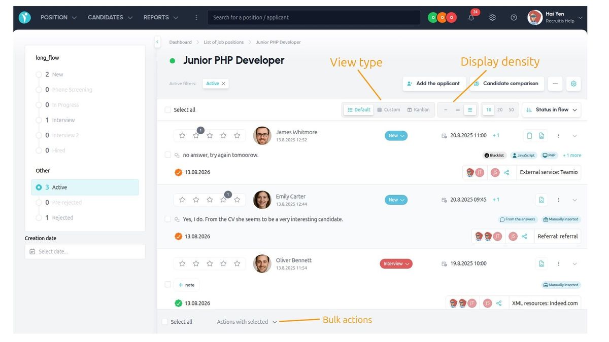
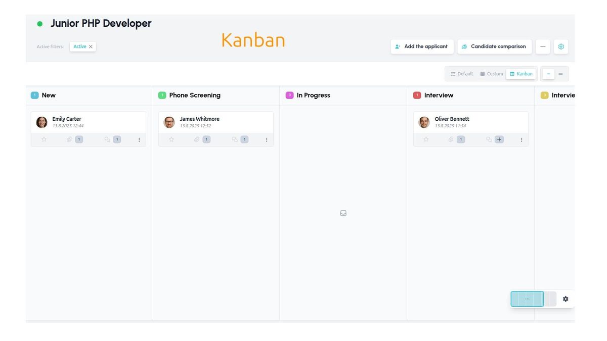
- You can switch the candidate view between table and kanban directly on the position
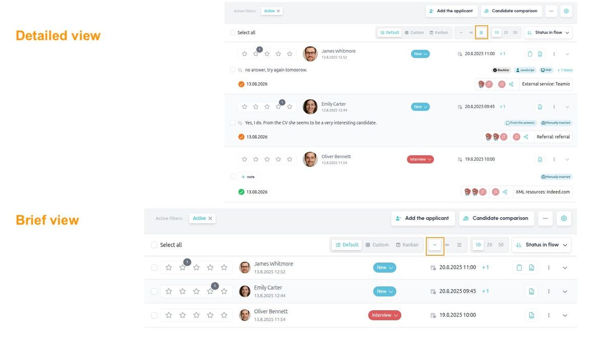
- Three row "density" types are available – from compact to detailed
- Besides the preset rows, you can create your own view of the data, where you set the individual columns and their order entirely yourself
- You can choose the number of candidates per page – no longer fixed at 10, you can also select 20 or 50
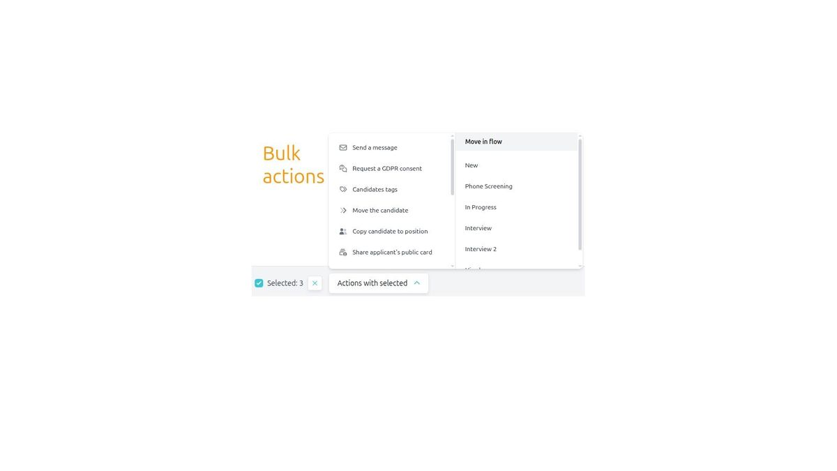
- Bulk actions are pinned to the bottom of the screen (so they're always visible without scrolling) and are triggered from a clear pop-up menu with a single click
- Action buttons next to the position settings are inherited from the position listing, giving you quick access to your most frequently used actions as buttons, without needing to go into the menu
- A multiple-positions indicator has been added next to the candidate's name, showing that the candidate applied to multiple positions and letting you see their status
- You can sort candidates by several criteria: creation date, name, flow status, scheduled interview date, SLA, candidate score
- You can filter candidates by application date to the position
- The candidate comparison button is now right next to the position actions, so you no longer need to go through the candidate card
- The actions menu is divided into several subsections, so you no longer have an "endless" list of actions
- The original "Other position actions" are now handled individually instead of being grouped together in the right panel